2편에서는 flutter_rating_bar를 조금더 활용을 해보겠습니다
전체 코드는 마지막에 넣어둘게요 ~!
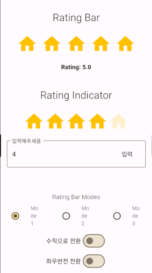
기능은 다음과 같습니다
1. 톱니바퀴 아이콘 클릭 아이콘 전체 변경
2. TextFormField 를 활용해 숫자로 표시
3. 3개의 모드로 평가를 다르게 표현 (1. 기본적인 , 2. 이미지 , 3. 평가마다 색상)
4, 수직 모드로 변경
5. 좌우 반전 변경
자 .. 이제 시작해 볼게요
1. 톱니바퀴 아이콘 클릭 아이콘 전체 변경
 IconButton(
                icon: Icon(Icons.settings),
                color: Colors.white,
                onPressed: () async {
                  _selectedIcon = await showDialog<IconData>(
                    context: context,
                    builder: (context) => IconAlert(),
                  );
                  _ratingBarMode = 1;
                  setState(() {});
                },
              ),

 //   IconData? _selectedIcon; // 변경 아이콘
 //   int _ratingBarMode = 1; // barMode
// 변경할수 있는 아이콘 다이얼로그를 띄운다.
class IconAlert extends StatelessWidget {
  @override
  Widget build(BuildContext context) {
    return AlertDialog(
      title: Text(
        '선택하잣 아이콘 !',
        style: TextStyle(
          fontWeight: FontWeight.w300,
        ),
      ),
      shape: RoundedRectangleBorder(
        borderRadius: BorderRadius.circular(10.0),
      ),
      titlePadding: EdgeInsets.all(12.0),
      contentPadding: EdgeInsets.all(0),
      content: Wrap(
        children: [
          _iconButton(context, Icons.home),
          _iconButton(context, Icons.airplanemode_active),
          _iconButton(context, Icons.euro_symbol),
          _iconButton(context, Icons.beach_access),
          _iconButton(context, Icons.attach_money),
          _iconButton(context, Icons.music_note),
          _iconButton(context, Icons.android),
          _iconButton(context, Icons.toys),
          _iconButton(context, Icons.language),
          _iconButton(context, Icons.landscape),
          _iconButton(context, Icons.ac_unit),
          _iconButton(context, Icons.star),
        ],
      ),
    );
  }

  Widget _iconButton(BuildContext context, IconData icon) => IconButton(
    icon: Icon(icon),
    onPressed: () => Navigator.pop(context, icon),
    splashColor: Colors.amberAccent,
    color: Colors.amber,
  );
}
IconButton으로 사용자가 아이콘을 클릭하면 IconAlert Widget 을 호출해서 아이콘을 띄워줍니다.
해당 아이콘을 클릭하면 icon을 가지고 _selectedIcon에 넣습니다.
간단하죠 .. ? 이게 끝입니다.
2. TextFormField 를 활용해 숫자로 표시
 RatingBarIndicator(
                    rating: _userRating,
                    itemBuilder: (context, index) => Icon(
                      _selectedIcon ?? Icons.star, // 초반 데이터 값은 별 모양 !
                      color: Colors.amber,
                    ),
                    itemCount: 5,
                    itemSize: 50.0,
                    unratedColor: Colors.amber.withAlpha(50),
                    direction: _isVertical ? Axis.vertical : Axis.horizontal,
                  ),
                  const SizedBox(height: 20.0),
                  Padding(
                    padding: EdgeInsets.symmetric(horizontal: 16.0),
                    child: TextFormField(
                      controller: _ratingController,
                      keyboardType: TextInputType.number,
                      decoration: InputDecoration(
                        border: OutlineInputBorder(),
                        hintText: '입력해주세욤',
                        labelText: '입력해주세욤',
                        suffixIcon: MaterialButton(
                          onPressed: () {
                            _userRating =
                                double.parse(_ratingController.text ?? '0.0');
                            setState(() {});
                          },
                          child: Text('입력'),
                        ),
                      ),
                    ),
                  )
사용자가 입력을 하면 _userRating에 담고 setState()를 해 rating에 값을 넣어준다 !
3. 3개의 모드로 평가를 다르게 표현 (1. 기본적인 , 2. 이미지 , 3. 평가마다 색상)
Widget _radio(int value) {
    return Expanded(
      child: RadioListTile<int>(
        value: value,
        groupValue: _ratingBarMode,
        dense: true,
        title: Text(
          'Mode $value',
          style: TextStyle(
            fontWeight: FontWeight.w300,
            fontSize: 12.0,
          ),
        ),
        onChanged: (value) {
          setState(() {
            _ratingBarMode = value!;
          });
        },
      ),
    );
  }

  Widget _ratingBar(int mode) {
    switch (mode) {
      case 1:

        // 기본적으로 많이 쓰이는것
        return RatingBar.builder(
          initialRating: _initialRating,
          minRating: 1,
          direction: _isVertical ? Axis.vertical : Axis.horizontal,
          allowHalfRating: true,
          unratedColor: Colors.amber.withAlpha(50),
          itemCount: 5,
          itemSize: 50.0,
          itemPadding: EdgeInsets.symmetric(horizontal: 4.0),
          itemBuilder: (context, _) => Icon(
            _selectedIcon ?? Icons.star,
            color: Colors.amber,
          ),
          onRatingUpdate: (rating) {
            setState(() {
              _rating = rating;
            });
          },
          updateOnDrag: true,
        );
      case 2:

        // 이미지 활용
        return RatingBar(
          initialRating: _initialRating,
          direction: _isVertical ? Axis.vertical : Axis.horizontal,
          allowHalfRating: true,
          itemCount: 5,
          ratingWidget: RatingWidget(
            full: _image('assets/heart.png'),
            half: _image('assets/heart_half.png'),
            empty: _image('assets/heart_border.png'),
          ),
          itemPadding: EdgeInsets.symmetric(horizontal: 4.0),
          onRatingUpdate: (rating) {
            setState(() {
              _rating = rating;
            });
          },
          updateOnDrag: true,
        );
      case 3:

        // 색깔별로 지정
        return RatingBar.builder(
          initialRating: _initialRating,
          direction: _isVertical ? Axis.vertical : Axis.horizontal,
          itemCount: 5,
          itemPadding: EdgeInsets.symmetric(horizontal: 4.0),
          itemBuilder: (context, index) {
            switch (index) {
              case 0:
                return Icon(
                  Icons.sentiment_very_dissatisfied,
                  color: Colors.red,
                );
              case 1:
                return Icon(
                  Icons.sentiment_dissatisfied,
                  color: Colors.redAccent,
                );
              case 2:
                return Icon(
                  Icons.sentiment_neutral,
                  color: Colors.amber,
                );
              case 3:
                return Icon(
                  Icons.sentiment_satisfied,
                  color: Colors.lightGreen,
                );
              case 4:
                return Icon(
                  Icons.sentiment_very_satisfied,
                  color: Colors.green,
                );
              default:
                return Container();
            }
          },
          onRatingUpdate: (rating) {
            setState(() {
              _rating = rating;
            });
          },
          updateOnDrag: true,
        );
      default:
        return Container();
    }
  }
_radio Widget 을 3개 생성해 모드마다 1, 2, 3 숫자를 보유한다.
_ratingBarMode 모드에 해당 _radio 숫자를 넣어주고 _ratingBarMode에 값을 다시 넣고
setState()를 한다.
그럼 _ratingBar Widget에서 switch 문으로 다른 RatingBar 을 그려준다 !
4 , 5 수직 , 좌우반전 전환
Switch(
                        value: _isVertical,
                        onChanged: (value) {
                          setState(() {
                            _isVertical = value;
                          });
                        },
                        activeColor: Colors.amber,
                      ),
Switch Widget 을 이용한다. 그리고 RatingBarIndicator 에 삼항연산자를 쓰면서 direction 에 넣으면 쉽게 가능하다 . !
전체코드 - Main.dart
import 'package:flutter/material.dart';
import 'package:flutter_rating_bar/flutter_rating_bar.dart';

void main() => runApp(MyApp());

class MyApp extends StatefulWidget {
  @override
  _MyAppState createState() => _MyAppState();
}

class _MyAppState extends State<MyApp> {
  late final _ratingController;
  late double _rating;

  double _userRating = 3.0;
  int _ratingBarMode = 1; // barMode
  double _initialRating = 2.0;
  bool _isRTLMode = false;
  bool _isVertical = false;

  IconData? _selectedIcon; // 변경 아이콘

  @override
  void initState() {
    super.initState();
    _ratingController = TextEditingController(text: '3.0');
    _rating = _initialRating;
  }

  @override
  Widget build(BuildContext context) {
    return MaterialApp(
      debugShowCheckedModeBanner: false,
      theme: ThemeData(
        colorSchemeSeed: Colors.amber,
        useMaterial3: true,
        appBarTheme: const AppBarTheme(backgroundColor: Colors.amber),
      ),
      home: Builder(
        builder: (context) => Scaffold(
          appBar: AppBar(
            title: const Text('Joo 와 함께하는 2번째시간'),
            actions: [
              // 설정에서 아이콘 변경
              IconButton(
                icon: Icon(Icons.settings),
                color: Colors.white,
                onPressed: () async {
                  _selectedIcon = await showDialog<IconData>(
                    context: context,
                    builder: (context) => IconAlert(),
                  );
                  _ratingBarMode = 1;
                  setState(() {});
                },
              ),
            ],
          ),
          body: Directionality( // 방향성을 설정해주는 위젯
            textDirection: _isRTLMode ? TextDirection.rtl : TextDirection.ltr,
            child: SingleChildScrollView(
              child: Column(
                crossAxisAlignment: CrossAxisAlignment.center,
                mainAxisSize: MainAxisSize.min,
                children: <Widget>[
                  SizedBox(
                    height: 40.0,
                  ),
                  _heading('Rating Bar'),
                  _ratingBar(_ratingBarMode),
                  const SizedBox(height: 20.0),
                  Text(
                    'Rating: $_rating',
                    style: TextStyle(fontWeight: FontWeight.bold),
                  ),
                  SizedBox(height: 40.0),
                  _heading('Rating Indicator'),
                  RatingBarIndicator(
                    rating: _userRating,
                    itemBuilder: (context, index) => Icon(
                      _selectedIcon ?? Icons.star, // 초반 데이터 값은 별 모양 !
                      color: Colors.amber,
                    ),
                    itemCount: 5,
                    itemSize: 50.0,
                    unratedColor: Colors.amber.withAlpha(50),
                    direction: _isVertical ? Axis.vertical : Axis.horizontal,
                  ),
                  const SizedBox(height: 20.0),
                  Padding(
                    padding: EdgeInsets.symmetric(horizontal: 16.0),
                    child: TextFormField(
                      controller: _ratingController,
                      keyboardType: TextInputType.number,
                      decoration: InputDecoration(
                        border: OutlineInputBorder(),
                        hintText: '입력해주세욤',
                        labelText: '입력해주세욤',
                        suffixIcon: MaterialButton(
                          onPressed: () {
                            _userRating =
                                double.parse(_ratingController.text ?? '0.0');
                            setState(() {});
                          },
                          child: Text('입력'),
                        ),
                      ),
                    ),
                  ),
                  SizedBox(height: 60.0),

                  Text(
                    'Rating Bar Modes',
                    style: TextStyle(fontWeight: FontWeight.w300),
                  ),
                  Row(
                    children: [
                      _radio(1),
                      _radio(2),
                      _radio(3),
                    ],
                  ),
                  Row(
                    mainAxisAlignment: MainAxisAlignment.center,
                    children: <Widget>[
                      Text(
                        '수직으로 전환',
                        style: TextStyle(fontWeight: FontWeight.w300),
                      ),
                      Switch(
                        value: _isVertical,
                        onChanged: (value) {
                          setState(() {
                            _isVertical = value;
                          });
                        },
                        activeColor: Colors.amber,
                      ),
                    ],
                  ),
                  Row(
                    mainAxisAlignment: MainAxisAlignment.center,
                    children: <Widget>[
                      Text(
                        '좌우반전 전환',
                        style: TextStyle(fontWeight: FontWeight.w300),
                      ),
                      Switch(
                        value: _isRTLMode,
                        onChanged: (value) {
                          setState(() {
                            _isRTLMode = value;
                          });
                        },
                        activeColor: Colors.amber,
                      ),
                    ],
                  ),
                ],
              ),
            ),
          ),
        ),
      ),
    );
  }

  Widget _radio(int value) {
    return Expanded(
      child: RadioListTile<int>(
        value: value,
        groupValue: _ratingBarMode,
        dense: true,
        title: Text(
          'Mode $value',
          style: TextStyle(
            fontWeight: FontWeight.w300,
            fontSize: 12.0,
          ),
        ),
        onChanged: (value) {
          setState(() {
            _ratingBarMode = value!;
          });
        },
      ),
    );
  }

  Widget _ratingBar(int mode) {
    switch (mode) {
      case 1:

        // 기본적으로 많이 쓰이는것
        return RatingBar.builder(
          initialRating: _initialRating,
          minRating: 1,
          direction: _isVertical ? Axis.vertical : Axis.horizontal,
          allowHalfRating: true,
          unratedColor: Colors.amber.withAlpha(50),
          itemCount: 5,
          itemSize: 50.0,
          itemPadding: EdgeInsets.symmetric(horizontal: 4.0),
          itemBuilder: (context, _) => Icon(
            _selectedIcon ?? Icons.star,
            color: Colors.amber,
          ),
          onRatingUpdate: (rating) {
            setState(() {
              _rating = rating;
            });
          },
          updateOnDrag: true,
        );
      case 2:

        // 이미지 활용
        return RatingBar(
          initialRating: _initialRating,
          direction: _isVertical ? Axis.vertical : Axis.horizontal,
          allowHalfRating: true,
          itemCount: 5,
          ratingWidget: RatingWidget(
            full: _image('assets/heart.png'),
            half: _image('assets/heart_half.png'),
            empty: _image('assets/heart_border.png'),
          ),
          itemPadding: EdgeInsets.symmetric(horizontal: 4.0),
          onRatingUpdate: (rating) {
            setState(() {
              _rating = rating;
            });
          },
          updateOnDrag: true,
        );
      case 3:

        // 색깔별로 지정
        return RatingBar.builder(
          initialRating: _initialRating,
          direction: _isVertical ? Axis.vertical : Axis.horizontal,
          itemCount: 5,
          itemPadding: EdgeInsets.symmetric(horizontal: 4.0),
          itemBuilder: (context, index) {
            switch (index) {
              case 0:
                return Icon(
                  Icons.sentiment_very_dissatisfied,
                  color: Colors.red,
                );
              case 1:
                return Icon(
                  Icons.sentiment_dissatisfied,
                  color: Colors.redAccent,
                );
              case 2:
                return Icon(
                  Icons.sentiment_neutral,
                  color: Colors.amber,
                );
              case 3:
                return Icon(
                  Icons.sentiment_satisfied,
                  color: Colors.lightGreen,
                );
              case 4:
                return Icon(
                  Icons.sentiment_very_satisfied,
                  color: Colors.green,
                );
              default:
                return Container();
            }
          },
          onRatingUpdate: (rating) {
            setState(() {
              _rating = rating;
            });
          },
          updateOnDrag: true,
        );
      default:
        return Container();
    }
  }

  Widget _image(String asset) {
    return Image.asset(
      asset,
      height: 30.0,
      width: 30.0,
      color: Colors.amber,
    );
  }

  Widget _heading(String text) => Column(
    children: [
      Text(
        text,
        style: TextStyle(
          fontWeight: FontWeight.w300,
          fontSize: 24.0,
        ),
      ),
      SizedBox(
        height: 20.0,
      ),
    ],
  );
}

// 변경할수 있는 아이콘 다이얼로그를 띄운다.
class IconAlert extends StatelessWidget {
  @override
  Widget build(BuildContext context) {
    return AlertDialog(
      title: Text(
        '선택하잣 아이콘 !',
        style: TextStyle(
          fontWeight: FontWeight.w300,
        ),
      ),
      shape: RoundedRectangleBorder(
        borderRadius: BorderRadius.circular(10.0),
      ),
      titlePadding: EdgeInsets.all(12.0),
      contentPadding: EdgeInsets.all(0),
      content: Wrap(
        children: [
          _iconButton(context, Icons.home),
          _iconButton(context, Icons.airplanemode_active),
          _iconButton(context, Icons.euro_symbol),
          _iconButton(context, Icons.beach_access),
          _iconButton(context, Icons.attach_money),
          _iconButton(context, Icons.music_note),
          _iconButton(context, Icons.android),
          _iconButton(context, Icons.toys),
          _iconButton(context, Icons.language),
          _iconButton(context, Icons.landscape),
          _iconButton(context, Icons.ac_unit),
          _iconButton(context, Icons.star),
        ],
      ),
    );
  }

  Widget _iconButton(BuildContext context, IconData icon) => IconButton(
    icon: Icon(icon),
    onPressed: () => Navigator.pop(context, icon),
    splashColor: Colors.amberAccent,
    color: Colors.amber,
  );
}
제가 쉽게 설명을 못 드린 거 같아서 죄송합니다 ㅠㅠ ..
더 노력해서 쉽게 정리해서 공유해 보겠습니다 !
See you next time ~~
'Flutter' 카테고리의 다른 글
| Dart 3.0 문법 (1) | 2024.02.21 |
|---|---|
| Flutter 3.7 & Dart 3.0 업데이트 내용 (0) | 2024.02.19 |
| Flutter pub.dev - 1) flutter_rating_bar 알아보기 (1) | 2024.02.07 |
| Flutter Provider - 꿀팁 ? ~ ? 🎈 (1) | 2024.01.03 |
| Flutter 네이티브 연결 (1) | 2023.11.14 |